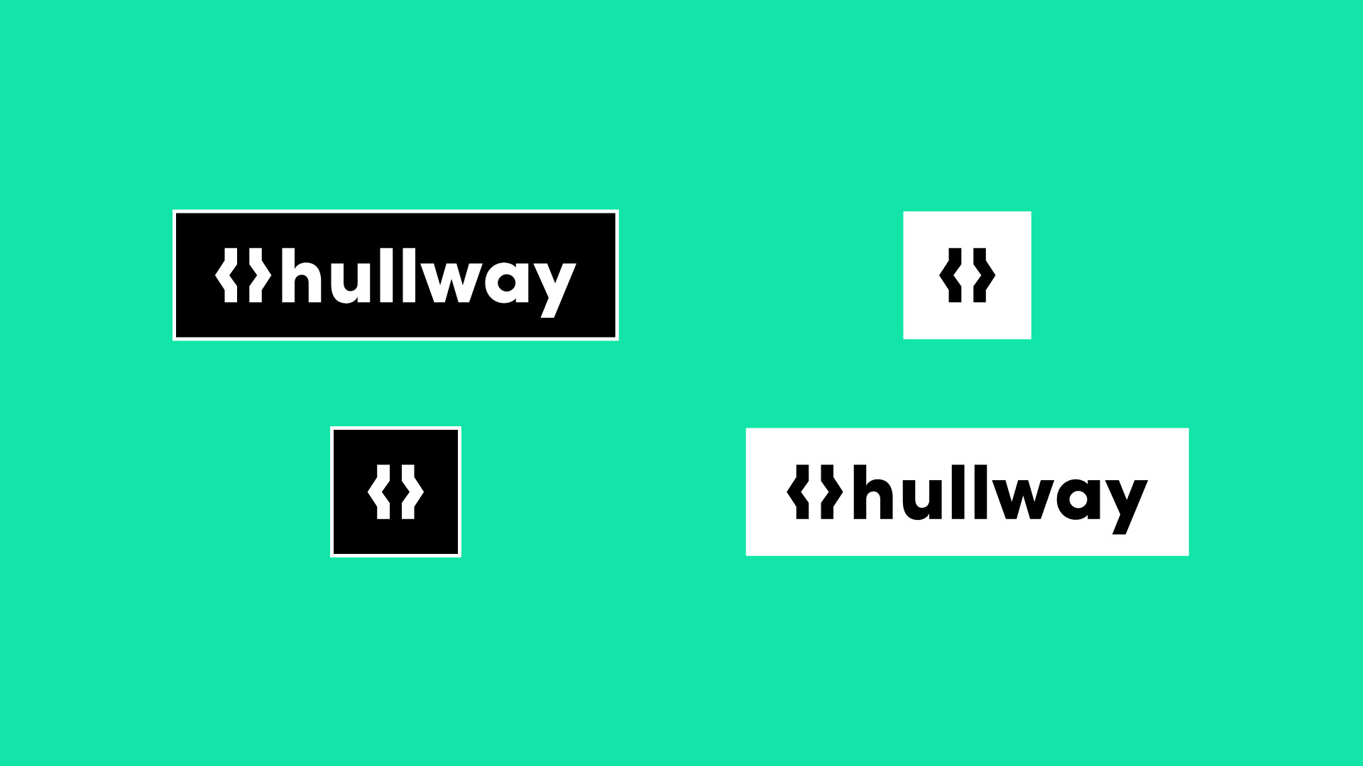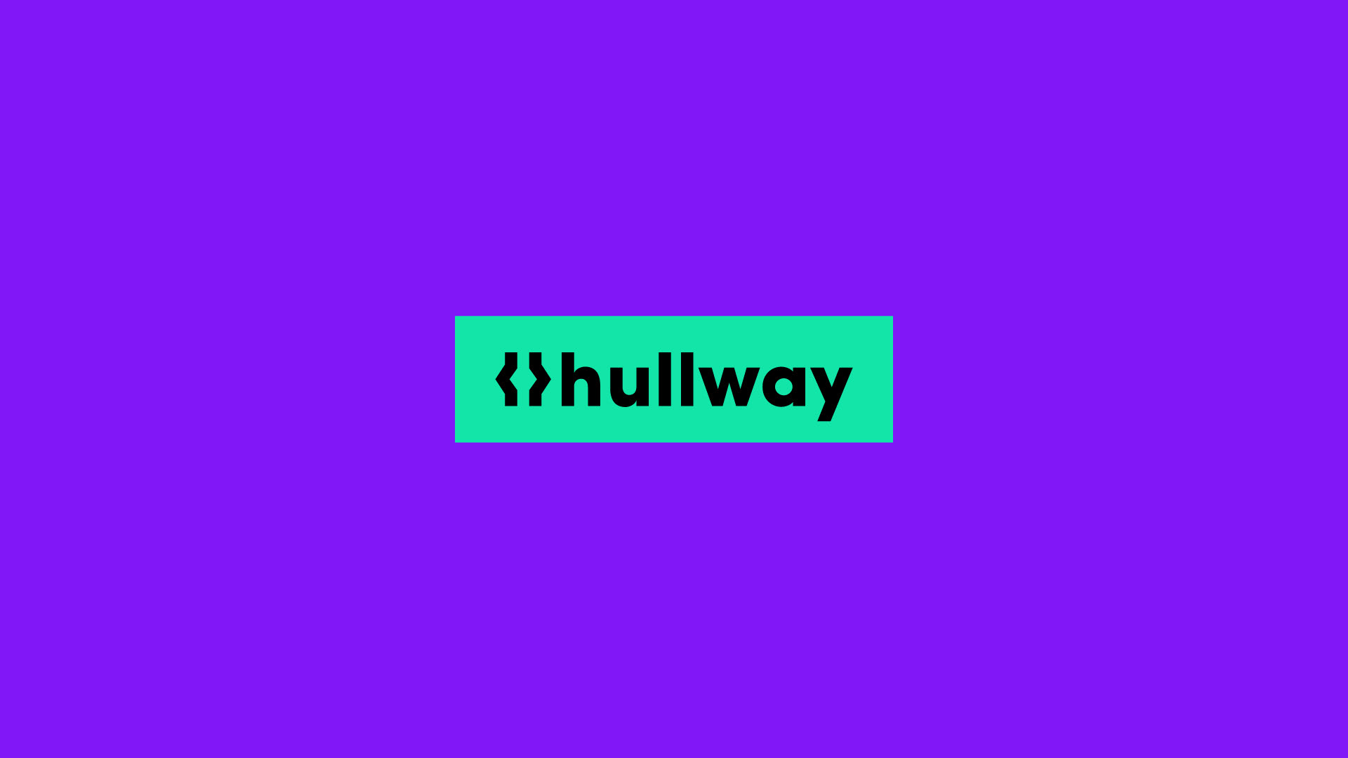
Hullway Identity
Straight-Talking CRO
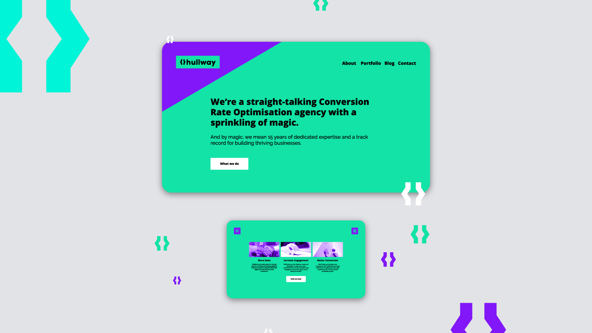
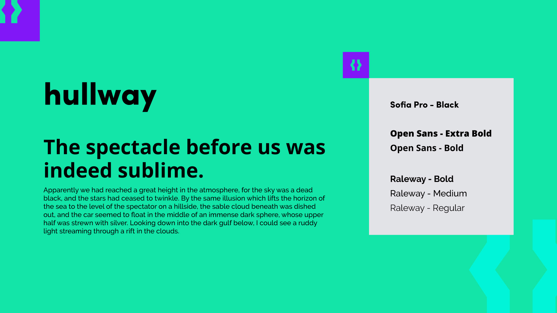
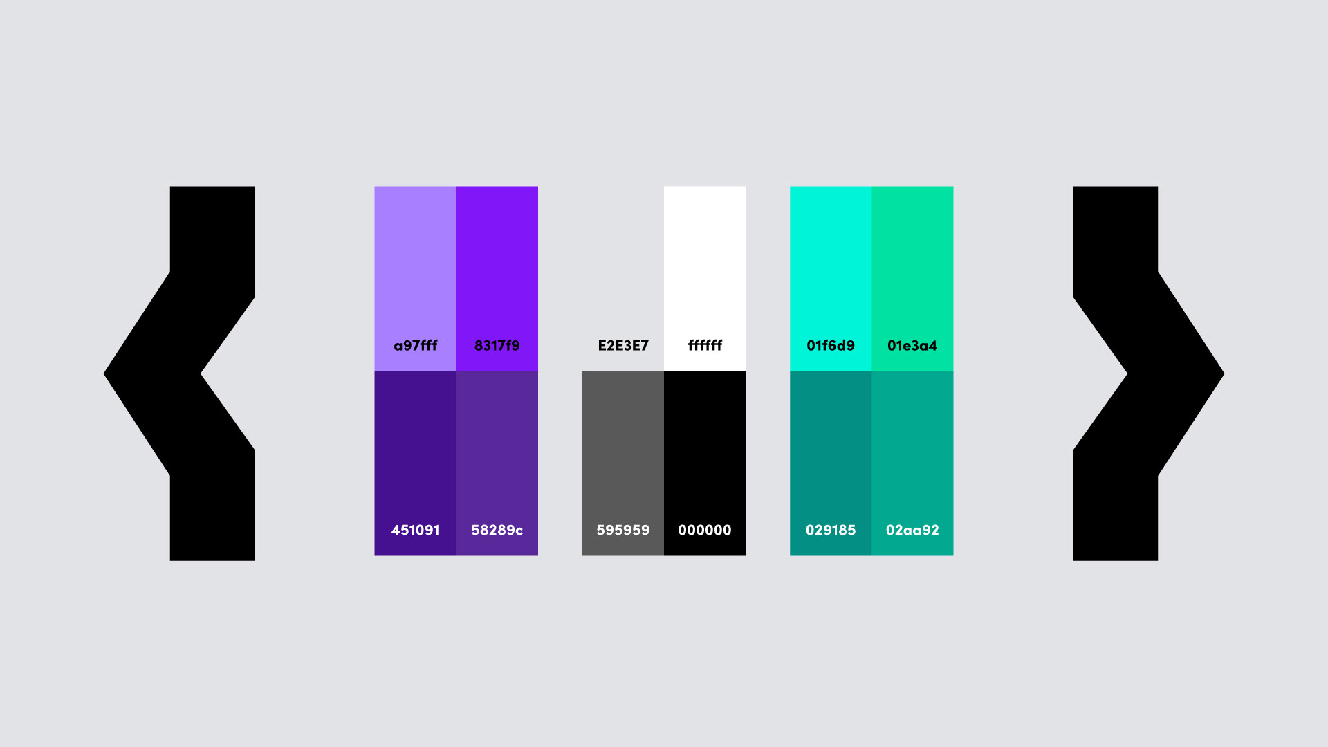
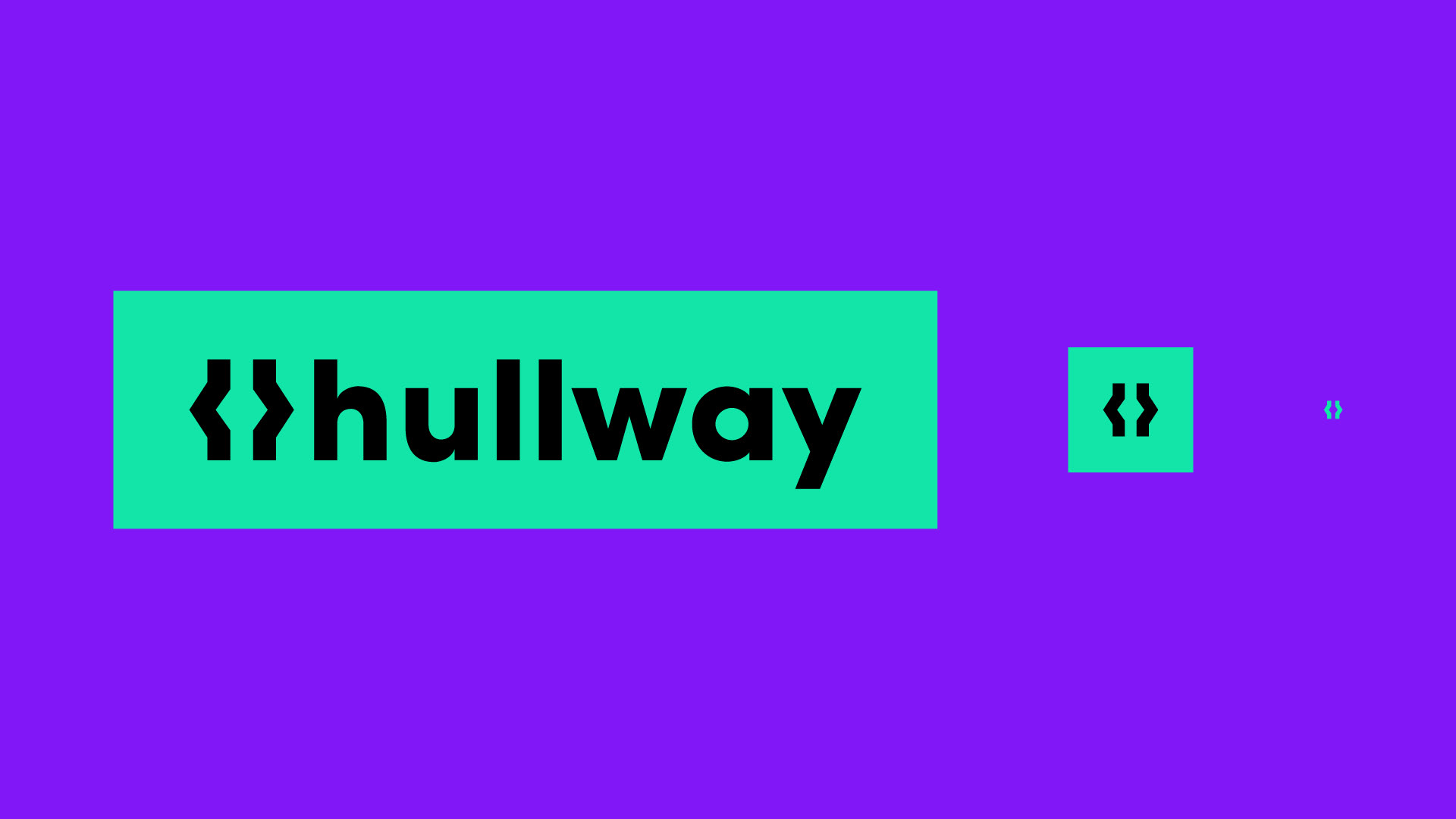
Conversion rate optimisation specialists, Hullway, needed a brand refresh. Using the idea that they are constantly working with code, the H was kept but cleaned, refined and incorporated the brackets. The bright colours give the business a bit of an edge in the field where most of the competition is using generic straight edge palettes.
The overall design was kept clean and minimal to give a straight-to-the-point kind of feel, as well as telling the client they are easy to communicate with.
Clarity, Minimalism, Boldness - The key points that were considered throughout.